Occasional Updates

This Process Chemistry Analytics Can Catalyse Your Results

Sometimes a catalyst is needed to accelerate significant improvements in production performance at industrial sites. The right process chemistry analytics can be the catalyst for better levels of performance and service. Is your process chemistry performing? Is your...

read more

What Makes A Great Musical Performance?

What makes a great musical performance? Is it the conductor? The soloist? The orchestra? The composer? Or, is it all of these things together? It is the subtle interplay of the musical instruments, the thousands of individual notes, the timing and the artistic...

read more

Mine Site Improves Process Chemistry

A mine site needed to improve the process chemistry at the thickeners. They had noticed that consumption of polymer (flocculant) and antiscalant was increasing. They also were seeing increased downtime and reduced recovery of valuable metal. It was more difficult to...

read more

What Is Process Chemistry Analytics?

It is an effective, innovative service model for chemical suppliers and industrial sites to optimise and improve their process chemistry. Not just cost cutting, but real improvements in productivity and profitability. Some examples of financial savings made by...

read more

Acknowledgement

PCA would like to thank Wikimedia Commons and the contributors for the rich resource of industry and statistics examples. All are available under the Attribution-ShareAlike 3.0 Unported (CC BY-SA 3.0) licence - https://creativecommons.org/licenses/by-sa/3.0/deed.en

read more

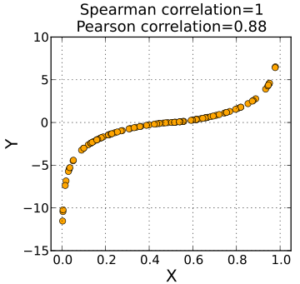
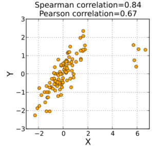
Scatterplot comparing Spearman and Pearson correlation 1

Attribution: Skbkekas [CC BY-SA 3.0], via Wikimedia Commons

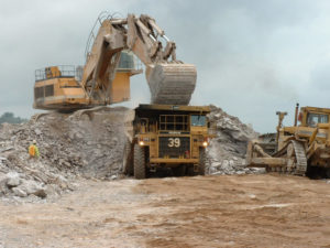
Mining at the Tarkwa Gold Mine in Ghana

Attribution: Iamgold [CC BY-SA 3.0], via Wikimedia Commons

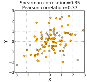
Scatterplot comparing Pearson and Spearman correlation 2

Attribution: Skbkekas [CC BY-SA 3.0], via Wikimedia Commons

Nippon Paper Industries, Akita Mill

Attribution: 掬茶 [CC BY-SA 4.0], via Wikimedia Commons

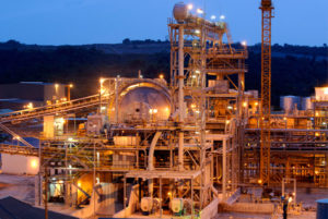
Tarkwa Processing Plant, Ghana

Attribution: Iamgold [CC BY-SA 3.0], via Wikimedia Commons

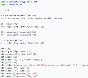
Python Code for Scatterplot comparing Pearson and Spearman correlation 2

Attribution: Skbkekas [CC BY-SA 3.0], via Wikimedia Commons

Scatterplot comparing Spearman and Pearson correlation 3

Attribution: Skbkekas [CC BY-SA 3.0], via Wikimedia Commons

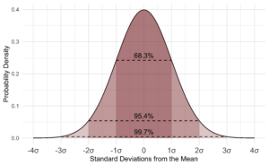
The Standard Normal Probability Distribution with shaded regions

Attribution: D Wells [CC BY-SA 4.0], via Wikimedia Commons

The Grampian Prepared Foods Factory, Industrial Estate Road, UK

Attribution: Eric Jones / The Grampian Prepared Foods Factory, Industrial Estate Road, via Wikimedia Commons

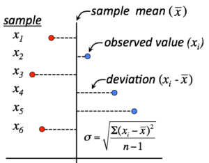
Visualisation of how standard deviation (σ) is calculated

Attribution: Thebiologyprimer [CC BY-SA 4.0], via Wikimedia Commons

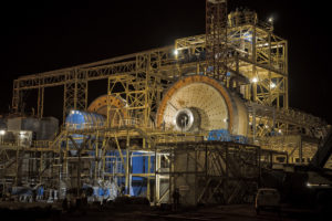
Processing facilities at the Essakane Mine in Burkina Faso

Attribution: Iamgold [CC BY-SA 3.0], via Wikimedia Commons

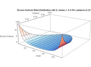
Excess Kurtosis Beta Distribution with mean for full range and variance from 0.05 to 0.25

Attribution: Dr. J. Rodal [CC BY-SA 3.0], via Wikimedia Commons

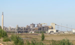
Mill in Hearst, Ontario, Canada

Attribution: P199 [CC BY-SA 3.0], via Wikimedia Commons

Nyrstar zinc factory near Budel-Dorplein (NL)

Attribution: Apdency [CC0], via Wikimedia Commons

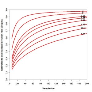
Graph of bias in estimated standard deviation vs. alpha (significance level) and N (sample size)

Attribution: Rb88guy [CC BY-SA 3.0], via Wikimedia Commons

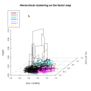
3D representation of a hierarchical tree defining a classification (cluster) performed after a factorial analysis of the multiple correspondences on the "tea" dataset available under R with FactoMineR

Attribution: Jackverr [CC BY-SA 3.0], via Wikimedia Commons

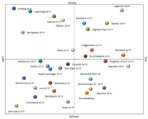
This is based on a print of the “Single Malt Whisky Flavor Map” which was designed by the “Friends of the Classic Malts”, Glasgow, and published in free copies 2007

Dave Broom was named as the Editor. Diageo funded the project.

Attribution: Tasma3197 [CC BY-SA 3.0], via Wikimedia Commons

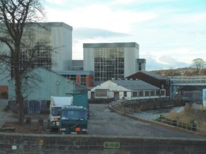
Cameronbridge Distillery, Scotland. This Diageo distillery is the birthplace of Cameronbridge pure grain whisky, and it is also where Gordons Gin, Smirnoff Vodka and other 'exotic' spirits are distilled

Attribution: James Allan / Cameronbridge Distillery, via Wikimedia Commons

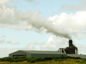
Norbord Factory, Scotland. Manufacturers of engineered wood based panel products

Attribution: Ivor MacKenzie / Norbord Factory, via Wikimedia Commons

Visit of an EITI commission 2008 in Ghana: In the caldera of the Ahafo mine, an open-pit mine of the Newmont Ghana Gold Limited

Attribution: The EITI [CC BY-SA 2.0], via Wikimedia Commons

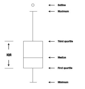
Box plot description

Attribution: Dcbmariano [CC BY-SA 4.0], via Wikimedia Commons

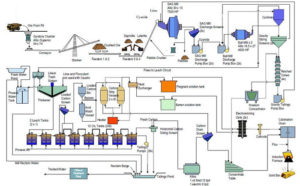
Processing scheme for the Rosebel Gold Mine in Suriname

Attribution: Iamgold [CC BY-SA 3.0], via Wikimedia Commons

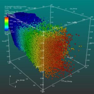
VisIt's Scatter plot allows for the visualisation of multivariate data of up to four dimensions

The Scatter plot takes multiple scalar variables and uses them for different axes in phase space. The different variables are combined to form coordinates in the phase space and they are displayed using glyphs and coloured using another scalar variable.

Attribution: UCRL [Public domain], via Wikimedia Commons

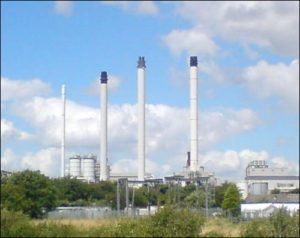
Kemsley Paper Mill, UK

Attribution: Joe White / Kemsley Paper Mill, via Wikimedia Commons

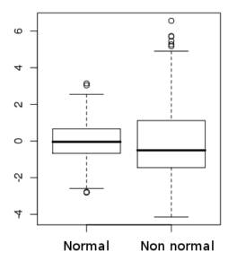
Box-plot of normal and non normal distribution. Created with R

Attribution: Gbdivers [CC BY-SA 3.0], via Wikimedia Commons

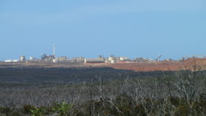
The Ravensthorpe Nickel Mine, Western Australia

Attribution: Calistemon [CC BY-SA 3.0], via Wikimedia Commons

An example of the bivariate Gaussian (normal), Student-t, Gumbel, and Clayton copulæ

Attribution: Avraham [CC BY 4.0], via Wikimedia Commons

This is number 5 Blast Furnace located at the Port Talbot Corus (now Tata) Steel Plant, UK

Attribution: Grubb at English Wikipedia [Public domain], via Wikimedia Commons

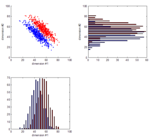
Data fusion involves techniques that combine data from multiple sources (dimension #1 & #2) and gather that information in order to achieve inferences (see scatter plot)

More effective and potentially more accurate than using a single source of data (one or the other histogram).

Attribution: Jarekt [CC BY-SA 3.0], via Wikimedia Commons

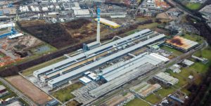
Aluminium smelter of TRIMET Aluminium, Essen, Germany

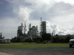
International Paper Company, Georgetown, USA

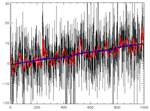
Image of random data plus trend, with best-fit line and smoothing curves

The data is 1000 points, with a trend of 1-in-100, with random normal noise of SD 10 superimposed. The r2 fit of the raw data is 0.08; of the 10-pt-smoothed, 0.57; of 100-pt-smoothed, 0.97. For the raw data, the simple trend line explains almost none of the variance of the time series (only 8%). For the 100-pt filtering, the trend line explains almost all of the data (97%). The trend lines are almost identical as are the confidence levels. It shows that a low r2 value should not be interpreted as evidence of lack of trend.

Attribution: Maksim [CC BY-SA 3.0], via Wikimedia Commons

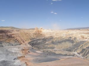
Twin Creeks gold mine, Nevada, USA; Carlin-style mineralisation in Mesozoic sedimentary rocks

Attribution: Geomartin [CC BY-SA 3.0], via Wikimedia Commons

Terra Mineralia. Minerals Exhibition TU Bergakademie Freiberg (Gypsum with Calcite in foreground)

Attribution: Kora27 [CC BY-SA 4.0], via Wikimedia Commons

Get Started Today

There is a need in the industrial marketplace for a trusted, independent, data-based service to assist suppliers and industrial sites to improve process and chemistry performance. PCA’s mission is to provide your business with that service.